Last week’s UFV Student Research Day got me thinking about research posters and the work that goes into producing a good one.

I was a judge for the Social Sciences, Humanities and Arts posters at the Student Research Day, so in this post I’ll talk about poster viewing situations and the difficulties of communicating complexity and substance in a research poster.
It’s all about the situation
I know, I know – you already understand that ‘communication is all about the audience’, but researchers producing posters need to think about the two situations where viewers will come into contact with their poster. Firstly, when a researcher is standing with their poster and secondly, when the poster stands alone.
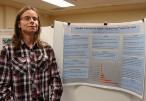
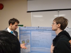
When a poster is used as a visual aid during a poster session, viewers are more interested in talking to the researcher rather than focusing on the poster. The poster becomes a visual aid for the researcher to get their main points across and answer viewer questions. Informative visuals (diagrams, maps, graphs, tables etc.) are essential for making key points.

Viewers will only spend five minutes or so at a poster. Can the visuals help viewers get the gist of the research in a few minutes? Will viewers put their back out bending down to see a visual? Keep visuals at eye level where possible. The presenters of the three winning posters in my judging category at the UFV Student Research Day all used prominently-placed informative visuals (top left or top centre) to get their main findings across: a map of broad-leaf maple tree poaching areas identified in the Fraser Valley, a map of Blackfoot oral history sites using Geographical Information Systems (GIS), and a graph depicting financial returns on Chilliwack seasonal agricultural enterprises.
Posters also stand alone. There will be times when the researcher won’t be there to ‘interpret’ their poster. Poster design needs to take account of attracting viewers and helping them navigate through the poster by themselves. Obviously, a title that can be read from 2-3 metres away and contains key words about the research (e.g. maple trees, Blackfoot, GIS, seasonal agriculture) is going to attract viewers interested the research subject. Specialised poster sessions allow researchers to use more technical terminology, but general poster sessions require generalised titles. I heard comments from some of my fellow judges last week that some of the posters on the Student Research Day contained too much text, and that the text was too small to read at a distance. In stand-alone situations, posters need text in a good size font and plenty of white space to encourage a viewer to move in closer to engage. It is tempting to try to say too much, but resist.

Indicative visuals (that guide viewers) become more important when posters stand alone. Two of the three winning posters last week used the traditional three column format and all three posters were designed to be read up-down, left to right. The information was broken up into smaller, manageable sections. Descriptive section headings are essential so viewers can ‘scan’. I have seen some good posters formatted in a circle that take viewers through the poster sections in a clockwise direction. If you think viewers might be confused, consider using arrows to guide them.
Complexity and substance
A visually-appealing poster is not a good research poster without engaging research content. Researchers attend poster presentations to meet other researchers and add to their own state of knowledge about research – they want to see something new. All three winning poster presenters tackled significant issues for particular communities. The student researchers conducted some original research on an issue, presented some data or interesting findings, and discussed the implications of the work for the affected community and/or other researchers.
Until very recently, research posters were considered the ‘poor cousin’ to the research presentation. But with technology making it easier to produce a professional-looking product, and the flexibility offered for viewers to come and go in poster sessions, this format is gaining in popularity. One thing to keep in mind is that posters can only convey so much, and not all research content is ideally suited to posters. For example, some research in branches of philosophy, literary studies or history (that traffic in theoretical concepts) might be difficult to translate easily to poster form. If the information in each section takes more than a few seconds for a viewer to adsorb, then it may not belong on a poster.
What can you bring along to complement your poster? This year’s AVP Research – Humanities & Social Sciences prize winner, Steve Clegg, brought along some maple wood samples to show the kind of ‘chunk’ that poachers take from trees. He put a piece of this wood up to the light to show viewers the attractive wood grain finish that poachers were after. For me, this made the presentation more memorable than the poster text alone.

If you decide to produce a poster for a research day or conference, remember to include the names of your supervisor/s or collaborators, institutional affiliations and your contact details on the poster. If the poster is an advertisement for your research, viewers need to know who is involved and how to contact you for more information.
Never been involved in a research poster event? Check out the first half of MarCom’s video of UFV’s Student Research Day 2013 to see what one looks like.
I also drew on Anu MacIntosh-Murray’s 2007 article on poster presentations in the journal, Science Communication to create this post.

