“Celebrate our successes”: Samantha Pattridge wins UFV’s first Inspirational Leadership Award

Perhaps the most commonly repeated mantra of the Communications department at UFV is that we need to “celebrate our successes,” but that’s a relatively new refrain. In the past, our department would often reach milestones or make significant accomplishments in relative quiet, representing missed opportunities to show how we were using new and innovative teaching practices or making major contributions to the broader institution. When asked to report about our activities, we made but passing mention of these achievements. Today, the department is putting a greater emphasis on celebrating those achievements and showcasing the work we’re doing. That shift in behaviour is largely the result of the leadership of our department head, Samantha Pattridge, who will be UFV’s first recipient of its Inspirational Leadership Award.

According to UFV’s award criteria, nominees for this award model the highest standards of professionalism and integrity, lead by example and through encouragement and inspiration for the benefit of others, promote respect and fairness, facilitate dialogue and collaboration, energize those working with them, champion the work of others above their own, and demonstrate genuine care and support for the career and personal development of others. The person or group who wrote these criteria set the bar high, making the award all the more important and meaningful for the recipients.

In nominating Samantha, I felt that I was living the creed that she so encourages: celebrating success; Samantha’s leadership is most definitely a success story worth celebrating.

When Samantha became chair of the department, she made a point of reaching out to me, a sessional instructor with little meaningful connection to the department, and she invited me out for coffee. More than just a perfunctory introduction, Samantha looked to understand my teaching interests and where I could positively contribute at UFV. As time went on, she encouraged me to teach more courses, sit on committees, and participate in special teaching projects outside of the department; I’m even going to be teaching at our Chandigarh campus in India in the fall. This kind of inclusion, respect, and encouragement is truly admirable; Samantha’s leadership shows that promoting a positive culture results in positive outcomes.

In a supporting letter of nomination, colleague Linda Pardy wrote “Samantha is an advocate for students and faculty. She is a superlative instructor and takes a leadership role in sharing her expertise. She is always working hard and committed to making her department, the student experience, and UFV better…. She also demonstrates leadership by encouraging faculty to challenge themselves and to continuously learn and try new teaching and learning strategies.”

One of our former Communications department heads, Lynn Kirkland Harvey, was quick to point out examples of how Samantha had encouraged and motivated members of the department by delegating leadership roles, such as chairing the curriculum committee, and encouraging innovative new ideas, such as bringing a major keynote speaker, Terry O’Reilly, to UFV as an unique learning opportunity both for students and the community-at-large.

New to the Communications department, Kim Norman wrote that “In interacting with Samantha, and watching her skillful, sincere, and respectful interactions with others, I have learned she consistently models excellent leadership…. She’s an excellent listener, model collaborator, and impressively savvy when it comes to her departmental and institutional knowledge, the latter a sign of her contagious passion for her work and deep commitment to her workplace. I’ve been impressed, too, with Samantha’s ability to balance her responsibilities as department head and many other institutional commitments with her teaching and scholarship. As a role model for how to lead a balanced, productive, and meaningful professional life, Samantha is impressive and inspiring.”

The purpose of this blog post is simple: to live the mantra “celebrate our successes.” In winning UFV’s Inspirational Leadership Award, we celebrate Samantha’s success as a valued colleague at UFV.

Congratulations, Samantha, on winning this well-deserved award.

Evolution of the news: Do you rely on social media?

news imageGuest blog by Damian van Woerden

Social Media is becoming the new delivery service for news. People no longer want to wait for news, pay for news, or be told what news is important for them. Jeff Sonderman, a professor of digital journalism at Georgetown University, states that journalism on social media today is nearly equal to television news (Sonderman, 2012). He goes on to say that one third of adults under the age of 30 get their news from social media.

The big question now is: How do I get accurate and reliable news?

The answer varies depending on what you, as a news reader, are looking for in the news. Not all social media sites share the same types of news articles. In addition, with different forms of social media come different levels of reliability in news reporting.

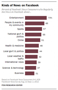
News Types on Facebook
Image taken from: Anderson & Caumont, 2014

News on Facebook

Anderson and Caumont (2014) tell us that Facebook tends to have more articles surrounding entertainment and sports. Their research shows that many articles shared on Facebook are lengthy and cover topics that are designed to gain interest and ‘likes’. This style of marketing news information is done by making news bits appear in our news feed as full size articles (Anderson & Caumont, 2014). News articles are usually quite large and require the reader to scroll down a page. As a result, not very many Facebook users follow breaking news or developing news events. Facebook has developed instant articles to increase viewer ship and, as a result, increase revenue from advertising. The two big benefits of Facebook, however, are being able to comment on news pieces and reading the articles that are shared by people on your friends list. After all, information shared by our friends most likely will interest us as well.

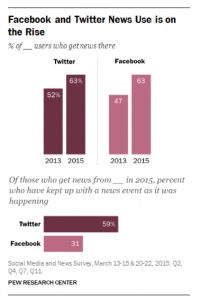
Facebook and Twitter News Use Statistics Graph
Image from: Barthel, Shearer, Gottfried, & Mitchell, 2015

News via Twitter

People who read the news on Twitter view different content than those who follow news on Facebook (Barthel, Shearer, Gottfried, & Mitchell, 2015). Since twitter only allows 140 characters per post, news information is brief, to the point, and gets updated frequently. As a result, news followers on Twitter are more likely to follow breaking news and developing news events. This ability to get quick updates quickly allow followers to get highlights on complicated news stories, such as politics and/or international news (Barthel, Shearer, Gottfried, & Mitchell, 2015). Twitter developed a new app for cellphones called Twitter Moments. This app displays all the biggest and most important news information easily for anyone to use. While news may not be marketed to gain specific followers, journalists use Twitter as a way to connect fast with an audience and keep them up to date with important news.

Gleaning accurate news

As a news reader, I want to make sure I am reading the most reliable and most accurate information on an event. The most common suggestions to find accurate news are the following:
• Follow a journalist on social media
• “Like” and Follow a reputable news organization
• Read multiple news articles on the same event
• Do not repost information that may be faulty

By following these suggestions, you can be sure to glean the best and most accurate news from social media.

With social media taking over the production and distribution of news, the quality of information being presented will begin to decrease. For the regular news reader, the real questions relating to gleaning accurate news are now:

What role will social media play in news reporting in the next 5 years?
Will newspapers, or even TV, still be relevant?
Will they disappear or just adapt like radio did after the TV was developed?
How will this effect the quality of my news information?

References

Anderson, M., & Caumont, A. (2014, 24 September). How social media is reshaping news. Retrieved from http://www.pewresearch.org/fact-tank/2014/09/24/how-social-media-is-reshaping-news/

Barthel, M., Shearer, E., Gottfried, J., & Mitchell, A. (2015, July 14). The Evolving Role of News on Twitter and Facebook. Retrieved from http://www.journalism.org/2015/07/14/the-evolving-role-of-news-on-twitter-and-facebook/

Facebook brings “instant articles” to News Feed. (2013, May 12). The Verge YouTube Channel. Retrieved from https://www.youtube.com/watch?v=zPvGF5bO0xs

News [image]. Retrieved from https://encrypted-tbn1.gstatic.com/images?q=tbn:ANd9GcSkimkX8gAzzLaHINhT_z9AnF-TKHkQt04Gi8cLq_iJTep9btuc

Sonderman, J. (2012, September 27). One-third of adults under 30 get news on social networks now. Retrieved from http://www.poynter.org/2012/one-third-of-adults-under-30-get-news-on-social-networks-now/189776/

Twitter Moments wants to make following the news easy. (2015, October 2015). The Verge YouTube Channel. Retrieved from https://www.youtube.com/watch?v=ah3vW6tzUiE

*******************************
About the author:

Damian van Woerden @CanadianDamian is a student at the University of the Fraser Valley studying Media and Communications as well as Criminology and Criminal Justice. He enjoys studying the effects of television and the role of news media in society. His goal is to graduate by January 2017 with a Bachelors of Arts degree and to find a full-time job in law enforcement.

#InstaAds: The Growing Form of Sponsored Advertisements

Guest post by Remington Fioraso

Advertisements are seen everywhere within the context of our daily lives. Whether it be on clothing, buses, billboards, television, print media, radio, or online media, it seems that we are unable to escape being marketed to. When looking into the realm of social media, advertising is very prominent. When previewing feeds on Twitter and Facebook, the user is bombarded with constant advertising. The social media platform Instagram is no different. The social media application focuses on visual content in the form of photos and videos leading to it being a potential marketing tool for organizations. What led to the emergence of Instagram as a means of promotion for organizations? Is it worth it for organizations to implement Instagram in their marketing strategies? Continue reading “InstaAds: The Growing Form of Sponsored Advertisements” to find out answers to both of these!

Image of instagram landing page

Instagram was launched in October 2010. In December of the same year, the platform reached a million users. Instagram has seen growth in usage every year.  In February 2016, it reached a total  of 400 million users. In 2016, it is estimated that the platform will see 15.1% growth (eMarketer, 2016). The popularity of the social network can also be illustrated through its content. There has been a total of 40 billion photos posted on the social network since its inception. This equates to 80 million photos that are being posted on a daily basis (Instagram, 2016).

Organizations are taking note of the growth seen by the social networking application. On November 1, 2013, Instagram implemented their program called Instagram Ads (Sorokina, 2014). It allows organizations to pay for prominent advertising known as sponsored content (Sternberg, 2013). Through Instagram Ads, the company will see 9.5% of Facebook’s total profits relating to mobile ads (eMarketer, 2016). This leads to the conclusion that it can be beneficial to incorporate in organization’s marketing strategies as they can target their respective audiences through another social media platform instead of solely on Twitter and Facebook. Who are these organizations? Was using Instagram an effective means of advertising for them?

polar ice vodka ad imageWhen looking at my own Instagram feed, an InstaAd for Polar Ice Vodka appeared. As seen to the left, the ad features the product prominently. The intention of using the Instagram Ad  program was to increase the reach and engagement of the brand. Was it actually effective? When previewing the post, it was notable that there were only 9 likes and 1 comment. This  demonstrates an example of an ineffective advertisement. Without the post being marked as sponsored and the inclusion of “Please enjoy our products responsibly,” it could have been posted on  any Instagram account. As it could have been a post that could be on any individual’s feed, it is not visually eye catching. Furthermore, the post did not incorporate a means to engage with the  content. It solely relies on the hashtags #PolarIceVodka, #winter, #ReadingWeek, #SpringBreak, and #staycation without providing a question to encourage users to interact further with the  content.

screenshot of canadian tire instagram sponsored ad

Canadian Tire is also a company that has utilized Instagram Ads in their marketing strategies. The most prominent usage of Instagram Ads was for their #ShovelItForward campaign (Quan, 2015).  The campaign’s purpose was to increase acts of kindness by Canadians through individuals documenting their experiences of shovelling driveways using the hashtag #ShoveItForward (Canadian Tire, 2015). When deeming if the post was effective or not, looking at the number of individuals who engaged with the post is important. This particular post received 281 likes and 96 comments. It was not simply promoting a brand, it was promoting a lifestyle action. It engaged users by encouraging them to do something within the community that is a relatively easy task. Furthermore, the post evoked emotions in consumers by showcasing the ‘everyday Canadian.’ The #ShovelItForward campaign advertisements can be determined to be both effective in increasing engagement and reach. As indicated by Canadian Tire, the ad campaign implemented through Instagram Ads assisted in increasing ad recall, awareness, and brand favourability (Instagram, 2015).

By looking at the advertisement by Polar Ice Vodka, Instagram Ads are not guaranteed to be successful. Yet the advertisement by Canadian Tire was deemed to be effective. It is very much dependent on the individual organization if it is worth it to implement Instagram in their marketing strategies. What may work for one company may not necessarily work for another. For tips on how to effectively incorporate ‘InstaAds’ to your brand, Social Media Examiner provides many tips on advertising on the social networking platform here.

References

Canadian Tire: Shovel It Forward. (c. 2015). Retrieved from http://shovelitforward.ca/

Instagram. (c. 2016). Retrieved from https://www.instagram.com/press/?hl=en

Instagram Continues Double-Digit Growth – eMarker. (n.d) Retrieved from http://www.emarketer.com/Article/Instagram-Continues-Double-Digit-Growth/1013612

Instagram for Business. (c. 2015). Retrieved from https://business.instagram.com/

Polar Vodka Ice (2016, February 15). #PolarIcevodka + #winter volleyball? Ace! #ReadingWeek #SpringBreak #staycation [Instagram update]. Retrieved from https://www.instagram.com/p/BB0M2P4HdMj/?taken-by=polaricevodka

Quan, K. (2015, February 13). Must-See Marketing: Canadian Tire wants you to “Shovel it Forward.” Canadian Business. Retrieved from http://www.canadianbusiness.com/innovation/must-see-marketing-20150213-canadian-tire-shovel-it-forward/

Sorokina, O. (2014, November 8). Instagram Ads: Everything You Need To Know. Hootsuite. Retrieved from https://blog.hootsuite.com/everything-you-need-to-know-instagram-ads/

Sternberg, J. (2013, April 18). Time to Define Native Advertising. Digiday. Retrieved from http://digiday.com/publishers/time-to-define-native-advertising/

*********************
Biography

Remington Fioraso is completing the final year of her Bachelor of Arts program in Sociology, Anthropology, and Media and Communication Studies. After graduation, her objective is to venture into the world of social media marketing and research. Connect with her via Twitter @RemingtonFD and her website https://remingtonfioraso.wordpress.com/

Top 6 Ways to Respond to Negative Feedback on Social Media

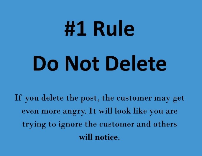
#1Rule Do Not Delete

Guest post by Megan Bukta

#1 Rule Do not delete

Every business owner wants their business to be successful, and may forget to plan for negative feedback from their customers. Businesses will receive feedback whether they like it or not, but being prepared to respond is the key to great customer service practices.

When a customer is frustrated with a service or product they tend to vent, and they are provided with a very public forum to vent through social media. Every business knows their customers and how to respond but there are important key tips for responding to negative feedback.

According to Mason Pelt @masonpelt, founder of @push_roi there are a number of ways to handle negative feedback on social media:

1. DO NOT DELETE – enough said

2. Develop a plan

Build a policy on how you plan to respond to feedback on social media. This should include a timeline to responding, resources for responding, and the type of response.

3. Stay positive

Try to avoid bring negative in your response, try to focus on a solution for the customer.

4. Avoid a debate

If a customer is being confrontational, try to address the issue at hand and give the customer an opportunity to contact you for further discussion, if applicable. If you try to make an excuse, ask questions or don’t give them the opportunity to take the discussion offline you may start a debate. Others will see the debate, possibly participate and the problem could get bigger than it originally was.

5. Don’t take it personally

This may be your personal business or a business you have a passion for but you have to avoid taking the negative feedback personally. Think objectively about the issue and try to find a solution for the customer

6. Take it offline

Give them your contact information, link to a feedback form, email address etc. to contact you in another format. If the customer decides to continue to complain online then others will see that you are taking the higher ground and giving them an opportunity to speak with you or the business directly.

Overall you want to respond quickly, validate their concern, and if you ask them to contact you privately, make sure that you follow up with them. With these tips remember that not every complaint is worth responding to, some will need to be deleted if they are using inappropriate language or threats. Use discretion when responding to customer complaints, sometimes you may need to put in more effort and sometimes you do not respond. Some people will be very difficult to please and some will join the conversation just to cause more trouble.

HoM ConsultingThis video on YouTube from HoM Consulting’s Kate Elfatah also addresses how you can manage customer complaints.

Complaints are not the only feedback on social media, hopefully there will be many positive responses. Try to respond to positive feedback as well. Thank the customer for their service and if they refer to any specific staff or example of what they were satisfied with make sure that you make note of that. In the end hopefully there will be more positive than negative feedback on social media. Customer service doesn’t begin and end with in person interaction, is also makes its way onto social media sites.

BC Ferries ExampleThere are many good and bad examples of how to respond to feedback. To get ideas on proper responses you can look at BC Transit and BC Ferries Facebook pages. Both of these companies are used to receiving negative feedback from customers and have found ways to respond while satisfying most customers. Here I have an example from the BC Ferries Facebook page where a customer is complaining about a cancelled service. With this example, what I thought they did well was:

  • Addressed the issues, i.e. safety concerns, policy
  • Gave the customer another way to contact them
  • Responded within 20 minutes

Like this example, if a customer, or others continue a debate the issue after the business addressed the concerns, sometimes other customers will join the conversation to back up the business. The next step for BC Ferries in this instance would be to make sure to follow up with the customer if they did send a private message. Take a look at the video I have create that looks at the BC Hydro Facebook page and showcases where you would put alternate methods of contact as well as how to define Social Media guidelines.

BC Hydro Facebook Page ScreenshotHow a business responds to negative feedback can make or break their business. If you follow the rules identified above you will be on the right track to creating a proper response. Get to know your customers and learn how to best serve them and understand how to respond to their feedback. Some customers only want to know that their complaint has been acknowledged. Keep in mind, whatever you post on social media is open for public viewing so keep it professional.

References

BC Ferries Facebook Page. (n.d.). Retrieved February 18, 2016, from https://www.facebook.com/BC-Ferries-119019564797374/%20

BC Hydro Facebook Page. (n.d.). Retrieved February 24, 2016, from https://www.facebook.com/bchydro/%20

BC Transit Facebook Page. (n.d.). Retrieved March 4, 2016, from https://www.facebook.com/bctransit/

Bukta, M. (2016, March 4). Social Media Example. Retrieved from https://www.youtube.com/watch?v=TMrX_aXUtdY&feature=youtu.be

Elfatah, K. (2015, August 14). Handling Customer Complaints on Social Media. Retrieved from https://www.youtube.com/watch?v=LGuFaNFqOmc

Pelt, M. (2015, May 29). How to Handle Negative Feedback in Social Media Like a Pro – Social Media Week. Retrieved February 18, 2016, from http://socialmediaweek.org/blog/2015/05/handle-negative-feedback-social-media-like-pro/

***************************

Author Bio: Megan Bukta works at the University of the Fraser Valley in the Career Centre and the Agriculture Centre of Excellence. Meghan is completing a Bachelor of Arts Degree in Adult Education.

Creating undergraduate research posters that work

by Samantha Pattridge, Communications Department and Jenn MacDonald, UFV Research Office

UFV Student Research Day in 2015
UFV Student Research Day in 2015: More talking than stand alone poster viewing

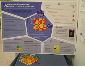
Communicating your research in progress is crucial for research success. A visually appealing and instructive poster will engage your viewers and generate discussion around your research. It’s essential to understand the poster viewing situation but it’s also important to understand the importance of visual elements.

Visual Presentations 101

Clegg GEOG 2013
An eye catching title and images that tell a story can overcome problems with large blocks of text

Think about your poster as a visual aid. Consider how you can tell your research story to others using images and graphics, appealing colours, engaging fonts and headlines. Visual elements are the first things your viewers will see. Your title and images should draw the viewer to your poster. Aim for a professional format, without overwhelming readers with blocks of text — so cut, cut cut!

As North American consumers, our sense of good design is “trained” by the advertisements we view every day. Right now, the trend is towards simplicity, with lots of white space (think Apple campaigns). Your poster can “cash in” on this often subconscious viewer preference. Provide lots of space around and between your text and images.

Make use of white space and contrast dark fonts with a light background

Some other points to consider are to:

  • create a clear contrast between fonts and the background
  • use black or dark coloured fonts on a light-coloured background
  • stick to two or three fonts and use a couple of different sizes
  • use bold to differentiate headings

Sans-serif fonts work better than Serif fonts for posters. Your main heading should be at least 130 point font and your smallest text around 36 point font. No one wants to squint to read.

Use alignment and consistency to your advantage. Strong lines draw the viewer’s eye to the information you want to highlight. Ensure nothing looks odd or out of place. Print out a small draft of your poster and turn it upside down and sideways. Check that the elements still look balanced.

If you depart from the usual reading pattern, use colour or other guides so that viewers know where to go
If you depart from the usual reading pattern, use colour or other guides so that your viewers know where to go

Your viewer will be expecting your poster to be arranged in a typical pattern to be read from top to bottom, left to right, like in a newspaper article. If you depart from that pattern, you can create a visually compelling poster, but you must take care to ensure it’s very clear to the viewer how to read the poster.

Understand the Competition: Know Your Discipline

Viewers and poster judges will expect to find information on your poster that demonstrates your membership to your discipline.

Know your discipline: Biology poster winner from 2015 UFV Student Research Day

Biology posters will differ in content and in design from history, sociology or visual arts posters. What sorts of evidence is acceptable? Is the interpretation of the findings a main concern? Each discipline has limits on what information can be visually translated onto a poster. If your research does not easily convert to visual form you might want to bring along a physical object that help you tell your research story.

Each discipline has its own “language”. While you want to appeal to your specific field, you also want to appeal to more general academic viewers. Tailor your information so it is interesting and accessible, but also include details that may be essential for your discipline. Do viewers need a map to orient then? Are you including specialist terms that need to be explained?

VIS ARTS Mot
Know your discipline: Visual Arts poster winner from 2015 UFV Student Research Day

During a poster session, viewers will spend more time talking to presenters than reading posters. Consider how you will use your poster to talk to viewers. Engage viewers initially with one sentence that captures your research question, your approach to making knowledge or key points from your findings. Consider what viewers will care about when they first encounter your work. Practice interacting with your poster and be passionate about what you’ve produced.


How did we get here? A short history of social media

Guest Blog by Nicole Macfarlane

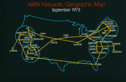
ARPA Network September 1973

Social media is as old as the Internet itself; as soon as we were connected we were making our own local chat servers and discussion boards.

Before the Internet

Telephone and radio were invented in 1890 and 1891 respectively. This marked the start of the information age for humans – prior to this, we communicated mostly via physical mail. The invention of the telephone was particularly important, as it literally laid the foundation for what became the Internet.

Our “Internet” – DARPANET

Initially ARPANET (Advanced Research Projects Agency network) renamed DARPANET (Department of Advanced Research Projects Agency Network) is the project that eventually became the Internet. Started by the US government as a means of communication, in 1969 four universities were connected and successfully communicated. Eventually growing to encompass the entire united states with Norway and London added shortly after, followed by the rest of the world.

Original ARPA Network

Early Internet communication

Three major technologies emerged pretty quickly and became fairly core to the operation of our social networks.

IRC (Internet Relay Chat) was a popular chat program. Users could connect to servers set up by peers and talk to large groups of people at a time. This idea of a centralized basic chat server hasn’t gone anywhere – IRC in its traditional form is still alive today, and IRC is employed in the back-end of a lot of public chat programs underneath all their bells and whistles.

Bulletin Board System (BBS) was the beginning of public forums. Typically community managed, people could register and post threads for other people to see. Better for slow communication, this was typically used to plan events and ask for advice to wider audiences within a community. The core idea is still alive in a lot of smaller online communities, and many programs have similarly structured components – Blackboard itself has a discussion section.

Around this time E-mail became a thing. Originally a service offered by AOL and CompuSERVE, this technology quickly spread with everyone wanting an email address. I’m assuming everyone reading knows how E-mail works, so I’ll leave it at that.

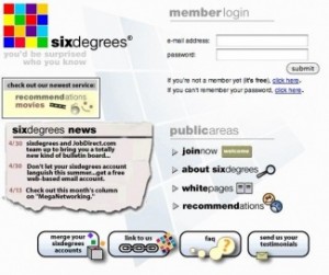
SixDegrees: The first major social networking website.

SixDegrees signup page image
SixDegrees signup page

Networking being the key term, SixDegrees was built around the idea that no person is separated from another by more than six people. It started the idea of social networks mapping the human condition. It allowed users to create profiles, invite friends, and manage groups to talk to other people. In the end it failed, it pushed the six degrees of communication very hard – users felt pressured to invite people they knew, and accept group invites from people they didn’t know. That, in combination with a large amount of spam accounts, signaled the demise of the website.

Friendster

Friendster signup page

The next major social networking site to pick up where SixDegrees failed was Friendster. Calling the SixDegrees principle its “Circle of Friends”, it boasted features similar to a dating website. Ultimately it failed, users wanted features the website wasn’t providing, the site was riddled with technical issues, and poor management decisions (namely not implementing new features fast enough) signaled its demise. Eventually they changed to try to appeal to a niche – in their case, the “gaming” audience. As of June 2015 their web services are officially paused and looking at their website (http://www.friendster.com/) only shows a notice that they are “taking a break.”

MySpace

The next major website to come along was MySpace. Most people probably recognize it, it’s the first major social media website a lot of people became familiar with. Learning

myspace signup page
MySpace signup page

from the mistakes of its predecessors, it boasted a lot of cool features to attract the disappointed Friendster audience. It gained a lot of popularity among teenagers due to the large focus on sharing music, a lot of popular bands shared songs and other information through MySpace at the time. The website, while still around and functional, ended up a failure. They offered a lot of non-targeted ads to gain revenue, which ended up causing them problems. Non-targeted ads tend to include ads with mature content, and since they had a large amount of younger users, they began to run into trouble for exposing minors to pornographic content. This led to a lot of musicians no longer using the site, and they began to hemorrhage users.

Facebook

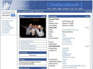
Original Facebook
Original Facebook

Originally launched in 2004 to Harvard students, they opened their doors to the world in 2006. Possessing all of the features of its predecessors but none of the faults, they quickly grew to the social networking giant we know today. Instead of large amounts of generic ads, Facebook tailored ads to what users liked or what they think they’d like. This allowed them to show less ads, have the ads be more likely to be clicked due to relevance, and charge more to people who wanted to advertise on their website. In addition, while MySpace required HTML knowledge to fully customize your profile, Facebook is very easy for everyone to customize their profile to their liking.

Social networking in 2016

As we sit currently, Facebook is the king of social networking in most of the world. A lot of other services have popped up to compliment each other (Instagram, Twitter, etc). Social media is at the highest point of popularity in its existence, with the advent of smart phones everyone is always connected. Perhaps Facebook will fall and Google+ will take its place, or perhaps the amount of investment people have in it will keep it going for a very long time.

Sources

Digital Trends (2014). The history of social networking. Retrieved from http://www.digitaltrends.com/features/the-history-of-social-networking/

Hendriks, D. (2013). Complete History of Social Media: Then And Now. Retrieved from http://smallbiztrends.com/2013/05/the-complete-history-of-social-media-infographic.html

Johnson, A. (2014). Why did myspace fail. Retrieved from http://www.gudideas.co.uk/social-marketing/why-did-myspace-fail-is-facebook-next

Leiner, B. et al. (ca. 2003). Brief History of the Internet. Retrieved from http://www.internetsociety.org/internet/what-internet/history-internet/brief-history-internet

Rouse, M. (2008). What is ARPANET? – Definition from WhatIs.com. Retrieved from http://searchnetworking.techtarget.com/definition/ARPANET

Vweb. (2017). History of the Internet. The Beacon. Retrieved from http://fios.verizon.com/history-of-the-internet/

*******************************

About the author: Nicole Macfarlane is a computer information systems student at the University of the Fraser Valley.

O’Reilly? O’MAZING!

by Kim Norman, UFV Communications Department

Terry O'Reilly sharing "The Power of Storytelling" at UFV March 1
Terry O’Reilly sharing “The Power of Storytelling” at UFV

Saying that CBC presenter Terry O’Reilly’s recent visit to UFV was a success IS telling a tale out of school. And, it’s a tale worth telling.

UFV students, staff, faculty and community members from the lower mainland came together on Tuesday, March 1 in the Great Hall of UFV’s new Student Union Building (the SUB) to hear Terry showcase some of his best stories and storytelling advice.

Early in the day, Terry treated a very full house of students and their instructors to a private presentation on “Elevator Pitches”. He thoroughly entertained with accounts of his past work experiences, marketing slogan successes, and colourful career highlights.

Edu-tainment, courtesy of Terry O’Reilly

He shared the highs and lows of his efforts to pitch his “No More Fiddling on the Roof” campaign, and he encouraged students to persist in finding meaningful careers with a story about once sending out 60 resumes that returned 61 rejection letters.

Terry responded to UFV students’ questions with great insights on the use of silence in presentations (he warned that “silence smells like fear”), the success of the Wheaties diamond campaign, and the role of elevator pitches in job interviews.

Terry also emphasized the importance of “learning by doing” when public speaking. He expressed disappointment that presentation skills are not taught more often in advertising-related courses. Terry said students would benefit greatly from taking public speaking courses, and he complimented UFV for offering them.

UFV students can take CMNS 235, a popular public speaking class, as a separate course or as part of a Professional Communications Essentials Certificate or a Communications Minor.

An engaged audience of over 400 sharing the power of stories

Terry returned to the stage in the afternoon to present “The Power of Storytelling”. This talk was part of the UFV President’s Leadership Lecture Series.

He engaged and inspired the 400+ people in attendance with captivating stories of hit marketing campaigns and the principles behind them. Those lucky enough to get a seat for the sold-out event probably found themselves sharing Terry’s words later in the week – and are probably still sharing them.

What Spock is to Kirk, reason is to feeling: stories must be understood and felt if they are to live long and prosper.
What Spock is to Kirk, reason is to feeling: stories must be understood and felt if they are to live long and prosper

Some of his memorable advice included:

“Great things are not written they are rewritten.”
“Stories resound for years or penetrate in seconds.”
“Words contain the seeds of change.”
“Customer service IS marketing.”
“The best marketers are the best listeners.”
“Storytelling makes people care.”
“‘It’s good enough’ is the enemy of everything.”
“Make people feel your message, not just understand it.”

Readers who didn’t get to #TerryintheValley or those who want to recapture the event can go to UFV’s Storify. For more Terry O’Reilly, listen to his much-acclaimed Under the Influence broadcasts on CBC radio.

As for a repeat visit from Terry one day, so he (and we) can tell more of his tales out of our school?

O’yes, please.

www.terryoreilly.ca
@terryoinfluence
@UFVCMNS

****************************************

Kim Norman is an Assistant Professor in the Communications Department at the University of the Fraser Valley. She has particular interests in popularization and the links between writing, rhetoric, and culture. Kim’s work in the non-profit sector, magazine industry, and education gives her almost 20 years of workplace and academic writing experience to draw on in her teaching of writing and research practices. Kim’s a firm believer that a commitment to education doesn’t just open doors—it reveals new ones.

Communicating research in two minutes

Samantha Pattridge and Michelle Riedlinger took up the challenge of speaking for only two minutes at UFV’s Faculty MicroLecture Series this week. They grabbed the stage at UFV’s Roadrunner Cafe and shared some of their findings and the implications of their research. Here are the highlights:

Teaching Communications when you have flipped

24636038443_09de267c7f_zIn 2012-13, Linda Pardy and Samantha surveyed four flipped sections of CMNS 251: Professional Report Writing, and one section of CMNS 420: Virtual Team Communication. Their goal was to determine the difference between expected and actual student and instructor workload in a flipped course. They used a strict definition of “flipped”, meaning that students met in class half of the usual three-hour block. They reserved class time for workshops, activities, group work, and peer editing. Any lectures or “content coverage” were handled online.

Linda and Samantha surveyed students three times during the term: near the beginning to establish their expectations, at the middle, and at the end. Linda and Samantha also kept reflective journals throughout the process.

24636031353_9bbdeae5fb_zSamantha reported on three significant findings:

  1. 70% of the students surveyed expected to spend between one and two hours online per week. But by the end of the course, only 56% reported spending that much time. More students spent three to four hours per week or more than expected.
  2. As instructors, Linda and Samantha had their own mindsets about teaching that they had to flip. Even if an instructor is accustomed to using active learning strategies in a face-to-face class, the flipped format has new and different demands on how to approach the material with the students. It requires a significant investment of time.
  3. Only 67% of students overall would recommend a flipped course. The reasons for not recommending it were often related to technology preparedness, but were also related to the ability to be self-directed online. Interestingly, 100% of the fourth-year students would recommend the flipped format. Samantha indicated that instructors must carefully consider the technology skills and academic maturity of students before flipping a course.

Linda and Samantha are presenting their findings at Congress in Calgary in May-June 2016. They also have plans to follow up with journal articles on various aspects of this survey.

Making sense of fishy science

24636049313_c643f716a3_zIn 2010, just after Michelle arrived in Canada, the BC government commissioned an inquiry into the dramatic decline of Sockeye salmon in the Fraser River. Michelle said that the transcripts of the testimonies from commission inquiry were a fantastic resource for her because so many different stakeholder groups testified at the commission. As a science communicator, she’s interested in better understanding how the differing perspectives of people shape the ways in which they understand and communicate evidence and risk.

Michelle’s study concerned the uptake of new ideas by groups of people with differing practices and values. She looked at the commission testimonies from a point of view of framing (what’s highlighted inside the frame and what’s obscured or outside the frame from the testimonies).

Michelle was particularly interested in the uptake of findings related to salmon anaemia virus genetics, and evidence of this virus in BC. She found that researchers committed to furthering scientific knowledge in general made sense of the findings about salmon anemia virus in terms of the Precautionary Principle and the need to take any evidence of the virus seriously. The researchers also called for more public communication about the implications of the findings. In contrast, researchers stating a commitment to management support for salmon industries spoke about the same research findings in terms of their concerns about “speculative science”. They also saw a need to “manage” public perceptions. Same findings. Different uptake.

24895169659_9d23e75e24_zMichelle also found that government research managers attributed a lack of useful ecosystems science happening in the region to the complexity of the science and a lack of adequate resourcing for activities. This research is indeed complex and costly. In contrast, Michelle found that conservation representatives resisted these framings and instead focussed on a lack of Indigenous community collaboration in research and the “politicisation” of science—that the Department of Fisheries and Oceans only fund politically-acceptable scientific research.

The Canadian government is promoting the ‘responsible conduct of research’ at the time. In light of this, Michelle believes that research organisations need to consider critical approaches to the communication and the use of research findings more than ever. She is speaking about this research at the 14th Public Communication of Science and Technology Conference in Istanbul, Turkey in April 2016.

Samantha and Michelle found the Microlectures to be a great opportunity to share their research findings with others at UFV. They encourage all UFV students to participate in UFV’s Student Research Day on Thursday, April 7, 2016. Students have three minutes to present their research at this event.

Samantha and Michelle are running a poster planning workshop for students on Friday March 11 from 10:30 am to 12:00 pm in the Kipp Research Lab (B164). Email kelly.tracey@ufv.ca for more details.


Prompting Customers to Take Action from your Social Media Sites

Guest Blog by Trieste Readingplane-landing

Customers today are faced with so many options of what products and services to buy and who to buy them from. This means that businesses need to find a way to convince them that they are the company to choose. A simple way for businesses to influence the purchasing decision of their customers is to send them to a landing page.

Landing Page

Visual example of homepage versus landing page

Hubspot describes

a landing page as a website page that allows you to capture a visitor’s information through a lead form. This lead form helps businesses convert a higher percentage of visitors to customers.

Conversion

Qualaroo explains that a conversion is when is a visitor to your website takes an action that you want them to take. This action can vary from making a purchase, to requesting an estimate, to simply downloading a document. Businesses, both large and small, can take advantage of landing pages by learning how to optimize them. Landing page or conversion rate optimization is a systematic approach to improving website performance, which combines analytics and objective (KPIs) to take the website traffic you have and make the most of it.

Effective sample landing page from Trulia

The Essentials

A landing page has several complicated elements that come together to create a cohesive page. To save you the time of having to read article after article; here are the 5 essential elements to create an effective landing page as listed by Hubspot:

1.       1. Limit Navigation

This page is designed for the user to take one specific action. You don’t want them to leave to visit another page so limit the number of exits from your landing page. One simple way to do this is to hide your navigation pane from the landing page.

2.       2. Deliver Value

Your customers need to feel comfortable to give up their contact information so that means you need to offer them something valuable in return. Make sure your offer is both compelling and trustworthy.

3.       3. Enable Sharing

Your audience can be your greatest marketing tool. Add share links to your landing page to encourage your website visitors to share your content with their friends.

4.       4. Keep It Short

You don’t want your visitors to have to scroll to far so place important content above the page fold and keep your lead form short and within the opening view of your page.

5.       5. Test, Test, Test

If you are to take away one thing from this blog, it’s that you always need to be testing your landing page. There is always room for improvement no matter who you are or what size your business. Test different landing pages against each other to see which are more successful.

Additional Considerations

For those who have mastered the essentials, I have provided a list of some additional elements from Qualaroo and Hubspot that I find to have the greatest impact when creating a landing page that will stand out from the competition.

Market Research

This sounds like it would be an immediate priority for businesses but sometimes the importance of conducting research to know your audience is overlooked. Hubspot writes that gathering vital information about you target market and customers will help you create value and provide a desirable customer experience.

The Design

I cannot begin to describe how important the design of a landing page is. If your visitors cannot visually understand what they are looking at, they will not stay to read what you have to say. The design of the page will not only generate interest but it will guide the customer to take the desired action. While the design can vary, you should always be sure you include these 6 elements:

  • Headline
  • Subheadline
  • Visual focus
  • Customer testimonial
  • Core benefits
  • Call to action

Infographic about designing a landing page

The Psychology of Colours

Humans are impacted by colour whether they realize it or not. In a study titled “The Impact of Color on Marketing,” researchers found that nearly 90% of consumer decisions about particular products are based on colour. That’s a pretty powerful number that shows how businesses can use colour to their advantage. In other words, know your audience, know what action you want them to take, and choose the colour that will convince them to take that action.

Using colour contrast

K.I.S.S Principle

Lastly, Keep it simple…you all know the expression. An eye tracking study conducted by Conversion XL found that it takes 2.6 seconds for a user’s eyes to land on the part of your site that will leave an impression. To make your landing page clear to understand, apply these 5 principles:

  • Use a bold catchy headline that highlights your benefits
  • List 3-5 core benefits in bullet point form
  • Add a visual focus to the left hand side of the page
  • Make sure your call to action button is clear and distinguishable
  • Remember that whitespace is a good thing

Conclusion

Lansing pages are a simple and effective marketing tool that all businesses, no matter their size or industry, should be taking advantage of. If you’re planning a campaign, don’t even think about launching it without having first designed a landing page. You’re now equipped with the tools you need to bring in more customers from your website, now it’s your turn to go build.

*********************************

Trieste is a marketing and communications student at the University of the Fraser Valley.