by Samantha Pattridge, Communications Department and Jenn MacDonald, UFV Research Office
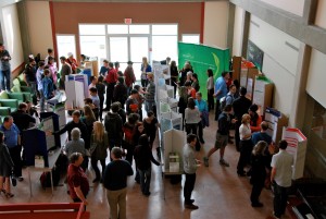
Communicating your research in progress is crucial for research success. A visually appealing and instructive poster will engage your viewers and generate discussion around your research. It’s essential to understand the poster viewing situation but it’s also important to understand the importance of visual elements.
Visual Presentations 101
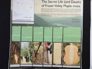
Think about your poster as a visual aid. Consider how you can tell your research story to others using images and graphics, appealing colours, engaging fonts and headlines. Visual elements are the first things your viewers will see. Your title and images should draw the viewer to your poster. Aim for a professional format, without overwhelming readers with blocks of text — so cut, cut cut!
As North American consumers, our sense of good design is “trained” by the advertisements we view every day. Right now, the trend is towards simplicity, with lots of white space (think Apple campaigns). Your poster can “cash in” on this often subconscious viewer preference. Provide lots of space around and between your text and images.
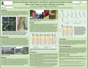
Some other points to consider are to:
- create a clear contrast between fonts and the background
- use black or dark coloured fonts on a light-coloured background
- stick to two or three fonts and use a couple of different sizes
- use bold to differentiate headings
Sans-serif fonts work better than Serif fonts for posters. Your main heading should be at least 130 point font and your smallest text around 36 point font. No one wants to squint to read.
Use alignment and consistency to your advantage. Strong lines draw the viewer’s eye to the information you want to highlight. Ensure nothing looks odd or out of place. Print out a small draft of your poster and turn it upside down and sideways. Check that the elements still look balanced.
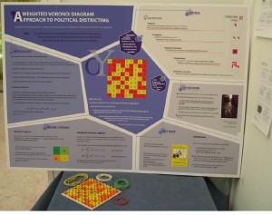
Your viewer will be expecting your poster to be arranged in a typical pattern to be read from top to bottom, left to right, like in a newspaper article. If you depart from that pattern, you can create a visually compelling poster, but you must take care to ensure it’s very clear to the viewer how to read the poster.
Understand the Competition: Know Your Discipline
Viewers and poster judges will expect to find information on your poster that demonstrates your membership to your discipline.
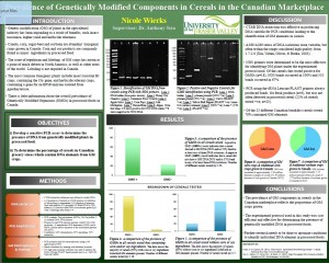
Biology posters will differ in content and in design from history, sociology or visual arts posters. What sorts of evidence is acceptable? Is the interpretation of the findings a main concern? Each discipline has limits on what information can be visually translated onto a poster. If your research does not easily convert to visual form you might want to bring along a physical object that help you tell your research story.
Each discipline has its own “language”. While you want to appeal to your specific field, you also want to appeal to more general academic viewers. Tailor your information so it is interesting and accessible, but also include details that may be essential for your discipline. Do viewers need a map to orient then? Are you including specialist terms that need to be explained?
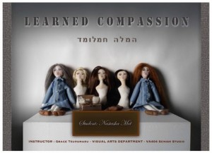
During a poster session, viewers will spend more time talking to presenters than reading posters. Consider how you will use your poster to talk to viewers. Engage viewers initially with one sentence that captures your research question, your approach to making knowledge or key points from your findings. Consider what viewers will care about when they first encounter your work. Practice interacting with your poster and be passionate about what you’ve produced.
